
Mumbai Street is a fictional Indian restaurant that celebrates the richness and authenticity of Mumbai’s street food. Inspired by the vibrant energy of the city and its spicy flavors, the concept offers an immersive, accessible, and friendly experience.
The restaurant’s identity was designed to reflect a warm and colorful universe, highlighting generous and modern cuisine while remaining faithful to tradition.
The logo features an elephant biting into a samosa, paired with the wordmark beneath it.
This combination of mascot and hand-drawn type was designed to work as well in small formats (social media) as in large ones (storefront, packaging).
The deep burgundy red background instantly grounds the identity in a warm, spicy, and recognizable world.
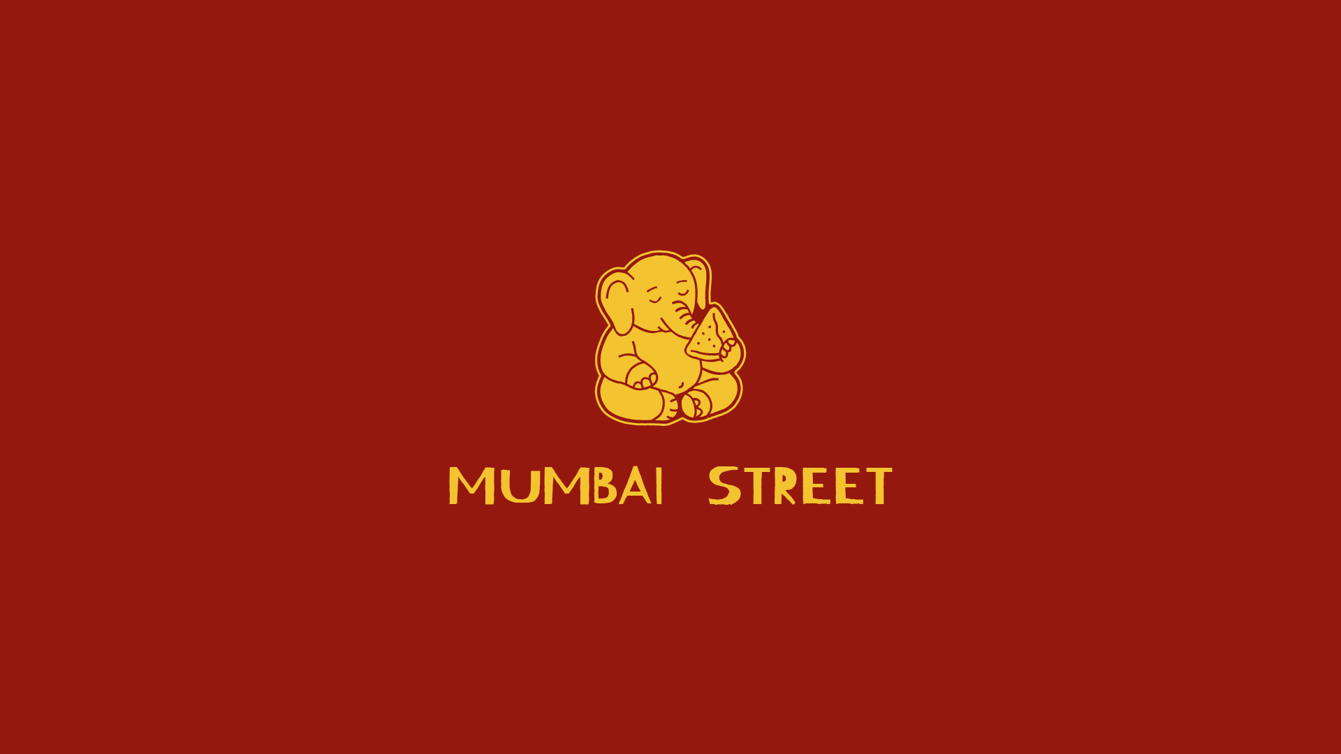
Instead of drawing the lettering entirely from scratch, I started from the Kierang Haerang typeface and modified it most notably reworking the "M" to build the wordmark.
The irregular, hand-painted feel of the typeface echoes the signage found on Mumbai's street stalls, bringing a raw, artisanal energy in line with the "street food" positioning the brand closer to a market stall than a fine-dining restaurant.

For product communication, I wanted a visual that makes you hungry on sight: a bold typographic repeat of "Tikka Masala" in the background, with the dish photographed slightly tilted to break the rigidity of the grid.
The film grain and red/saffron palette keep it consistent with the rest of the identity while giving it a punchier "food content" feel suited to Instagram.

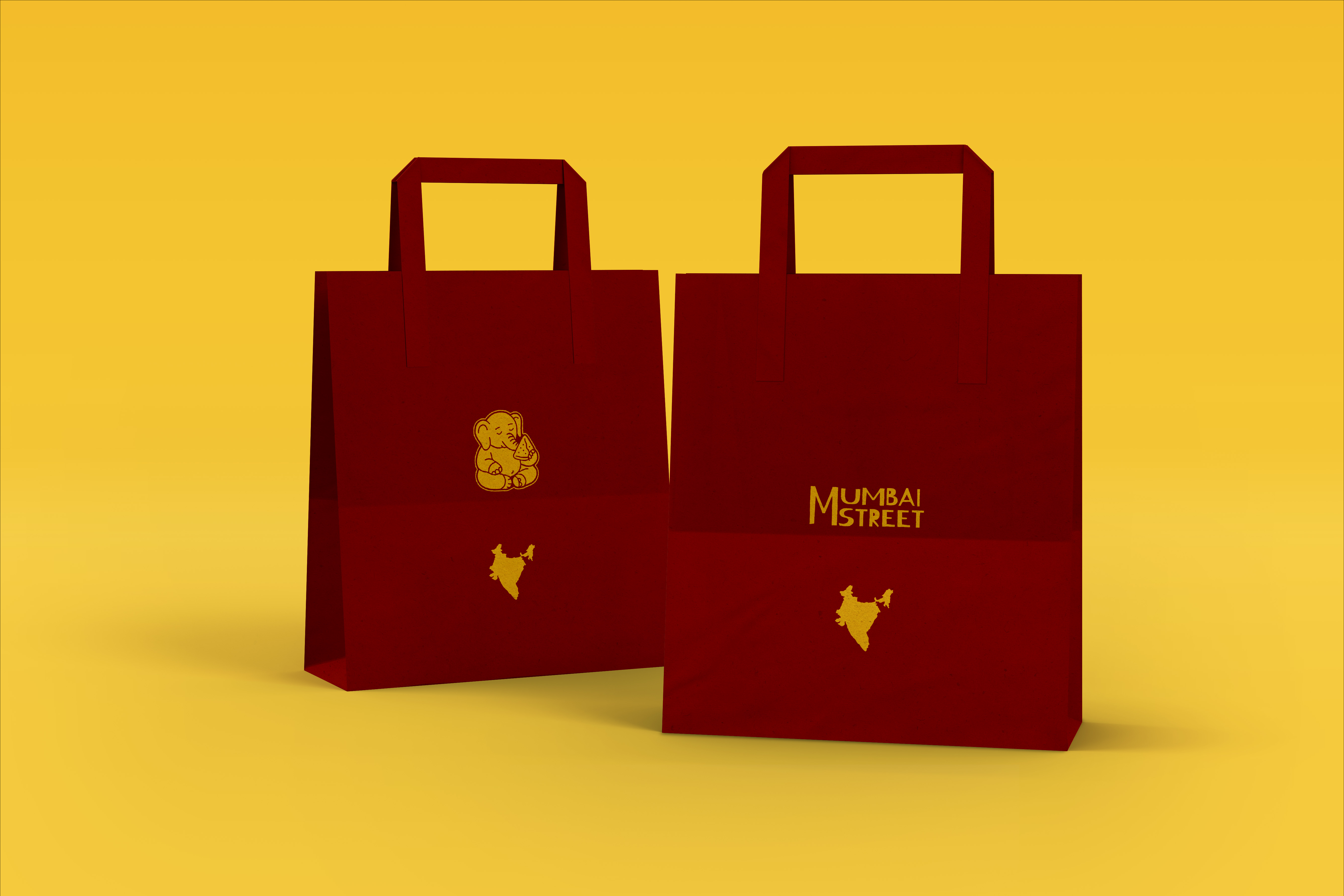
The takeaway bag becomes a brand touchpoint in its own right, designed for two uses: an "event-style" bag featuring the mascot and a map silhouette of India, and a more institutional bag centered on the wordmark covering different order formats without multiplying the number of variations.
For digital touchpoints (website, social media, in-store screens), the logo animation features warm, friendly words like greetings or food-related expressions, sliding in from alternating directions, left to right and right to left.
This simple, looping motion gives the brand a more lively, welcoming presence without relying on text-heavy explanations.

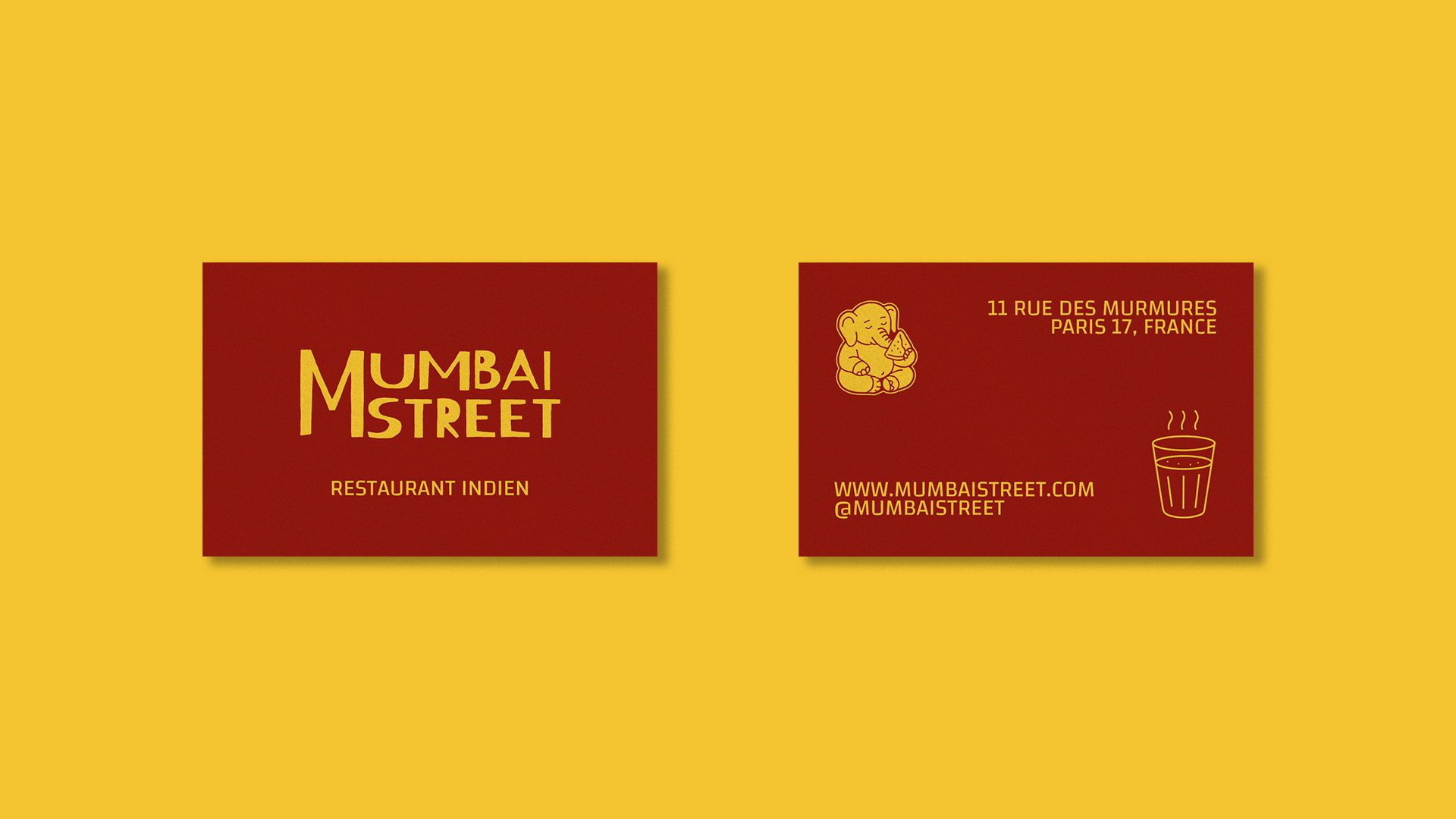
The business card distills the visual system to its simplest form: the wordmark alone on the front, the mascot and practical details on the back.
The steaming chai glass icon, paired with the Ganesh illustration, reinforces the "warm, convivial street food" visual field from the very first touchpoint with the brand.
Even a transactional touchpoint like the receipt carries the brand's identity: the elephant mascot and wordmark appear in monochrome at the top, keeping the system recognizable even in black and white, low-cost thermal printing. It's a small detail, but it ensures the brand stays consistent all the way to the final moment of the customer experience.
